What Interior Designers Are Saying About Texture
Texture usage is an oft-overlooked part of interior design to those who are not designers, but has recently experienced a surge of interest in the general public. Designers never forget this vital part of setting the mood and feel of a room. There are two different types of texture: tactile texture and visual texture. Tactile texture consists of the sensory experiences one has with the three-dimensional objects in a room. For example, does the floor, counter, wall, drapes, accent pieces, etc. feel rough, smooth, or bumpy? Visual texture is how much visual space a texture takes up combined with how the object or area looks like it might feel. Both methods of using texture are key to setting the tone in the room you are designing.
How Tactile Texture Influences Style and Atmosphere
The way in which you use the physical appearance and feel of a textured surface will convey the mood and warmth of your room. The peaks and valleys of a rough surface, especially one found in nature, cast irregular shadows, giving a biophilic, adventurous feel, whereas the cool, glossy appearance of a smooth surface will create a modern, minimalist atmosphere for any business or home.
To create a modern, ultra-modern or brighter tone or mood, use smoother surfaces, such as metallic or stainless steel textures. Smooth textures, especially those with a gloss, reflect more light, which lighten your room and give it a more contemporary vibe. Metallic textures such as chrome often convey a high-tech, professional or modern tone since there are very few irregularities in polished metal. Smooth textures also work best for a formal design that needs a clean, organized feel devoid of overly detailed or fussy characteristics.
Rough textures, like stone, usually convey a natural, relaxing feel thanks to many unpredictable angles and shapes they contain, aka those found in nature. Designers often take advantage of direct spotlights on textures such as these to accentuate the imperfections in the design and capitalize on the organic feel. This trick enhances the visual space and impact a texture makes.
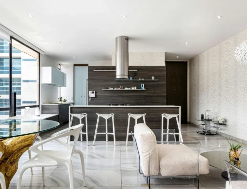
Combining both smooth and rough surfaces is a great way to create an eclectic or transitional room. The right contrast of smooth and rough surfaces, whether real or faux, can be quite impactful and absolutely beautiful.
")
How Visual Texture Influences Style and Atmosphere
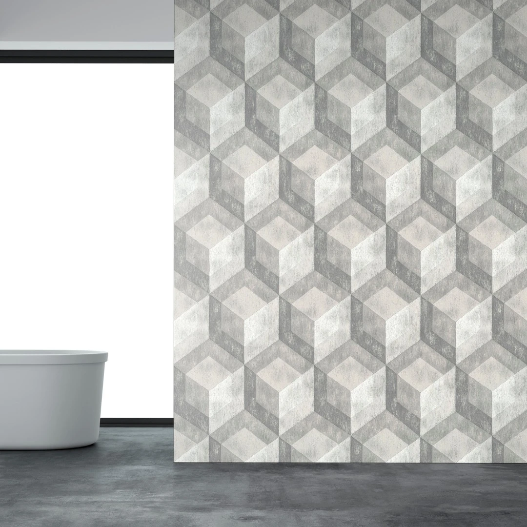
Not unlike the usage of tactile texture, visual texture also affects the mood of the room, but with a twist – the texture is only perceived, not real. Using faux textures is a great way to get a similar effect with less cost or using less space. The most effective ways to use visual texture include using faux textures in designs that are meant to imitate other materials, color, and space. Examples of these are using jagged, brown lines to imitate wood or jagged, white lines to imitate marble or using wallpaper or synthetic materials made to imitate nature. Geometric shapes in wallpaper or tiles have a similar effect on the mood of a room, but are most often used in modern designs. Switching the shapes and colors in surprising ways can put an artistic spin on a design.
In a way similar to smooth surfaces, lighter colors reflect light, so using textures in light colors will make your room seem brighter than it actually is. Varying patterns in a light color can take up more visual space without becoming a three-dimensional surface thus darkening the room.
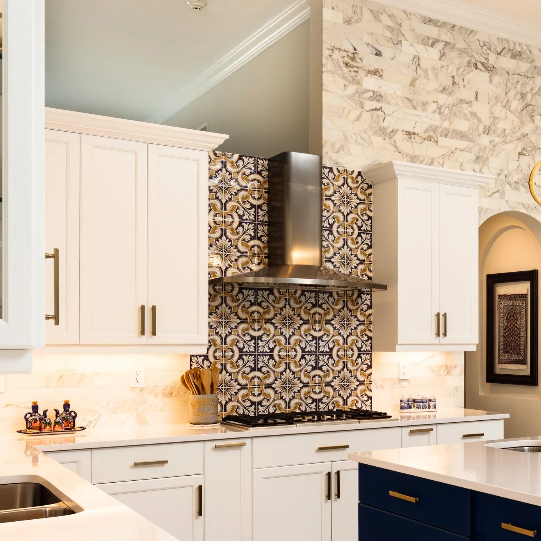
Darker colors absorb light and set a cozier, more romantic or moodier feel. Deeping the effect with textures in dark colors will make your room feel warmer and more inviting – they help to create a room where occupants feel encouraged to relax and stay a while. If the kitchen you’re designing is quite spacious and needs a more intimate, friendlier feel, a moderately rough texture in a darker color may suit the look perfectly. For example, imagine a rough-hewn kitchen table on slate tile in a large, traditional kitchen. If your room is smaller and needs a cleaner, brighter look, a lighter color with smoother textures might work best. Picture a herringbone beige tile pattern above a sand-texture silestone counter. A ruched linen shade behind a brushed nickel faucet completes the look for this inviting, smaller transitional kitchen.
Finally, using shiny, metallic colors and straight lines can make wallpaper feel like stainless steel, without being stainless steel. Using a splotchy, rocky pattern can make a surface feel like stone without using synthetic or imitated stone for an impressionist take.
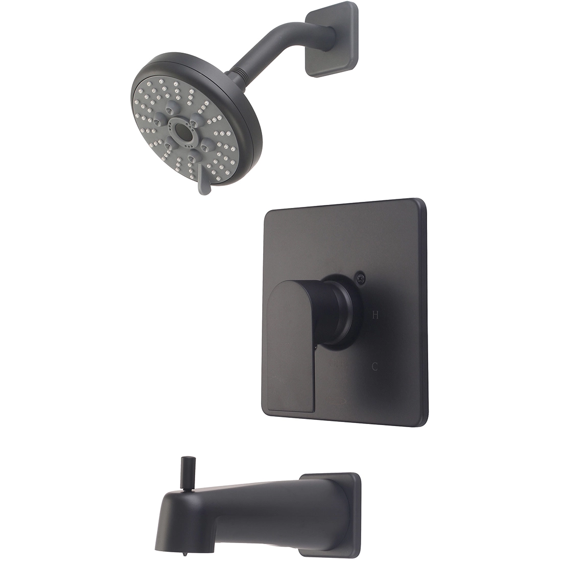
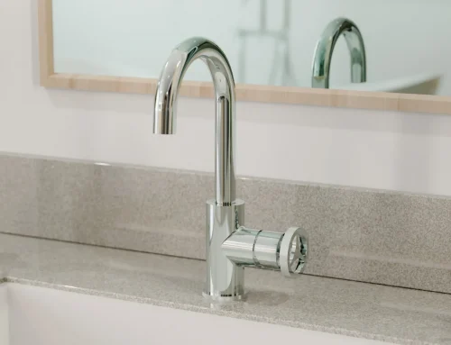
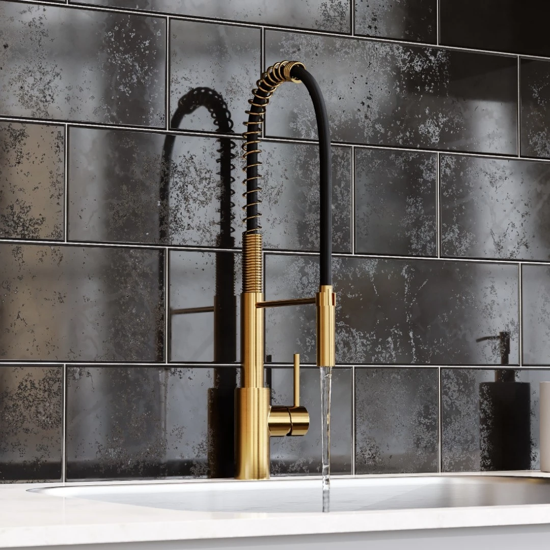
Complement Textures in Design With Metallic Textures on Faucets and Appliances
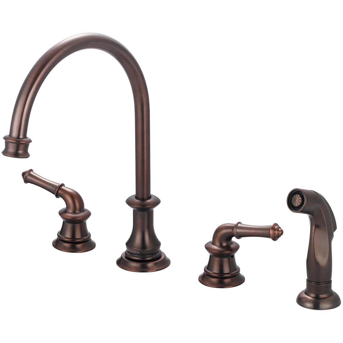
In the bathroom and kitchen, put a finishing touch on the textures in your room’s soft and hard goods by choosing complementary metallic textures on the faucets and appliances you choose. For a modern room with smooth, glossy or matte finishes, the smooth, sleek texture of chrome with amp up the modern feel while a matte black faucet with soften the modern feel to take any perceived edges off. Using the striated texture of an oil-rubbed bronze faucet will instantly warm up a room and bring the cozy, reminiscent ambiance of the hustle and bustle of bygone, simpler days to a traditional kitchen.
Which One is Right for Me?
Depending on the size of the room you are decorating and the mood you want to create, you can mix and match rough and smooth textures with warm and cool colors. To enlarge a small, professional space, a smooth texture with bright colors will work well. Using materials such as stainless steel or chrome, or colors that are light, will create the modern and bright atmosphere that your design needs.
To create a relaxing, “stay a while” atmosphere, darker colors and rougher textures will bring nature and friendly disorder into your design, which will give your room a casual feel. In a kitchen or bathroom, natural styles such as these will help ease the feeling and promote relaxation. Both have their benefits and choosing one is a purely personal decision. If designing areas for a multi-family building, opting for neutral colors and transitional designs tend to please the most people and resist becoming dated.
How to Keep Faucet Textures Looking New for Years to Come
Pioneer uses a proprietary finish to protect every faucet the company makes and backs up their quality standards with an industry-leading and truly fantastic warranty.
We’ll Save You Money and Time
There are many ways to the same destination. This saying applies to multifamily housing builds just as much as to anything else in life. The ultimate goal is save as much money as possible while delivering a great finished project – that’s simply showing smart business sense. But, finding a one-off deal or sacrificing quality isn’t the only way to get a healthy ROI. We have a better way.
Pioneer works with professionals every day to develop specification packages and plans that save our valued partners both time and money, sometimes in surprising ways. It’s our goal to ensure your project meets or exceeds its expected outcome. We want to get to know you and your company and show you how we can save you money. Please reach out via our website form or call us at (800) 338-9468.
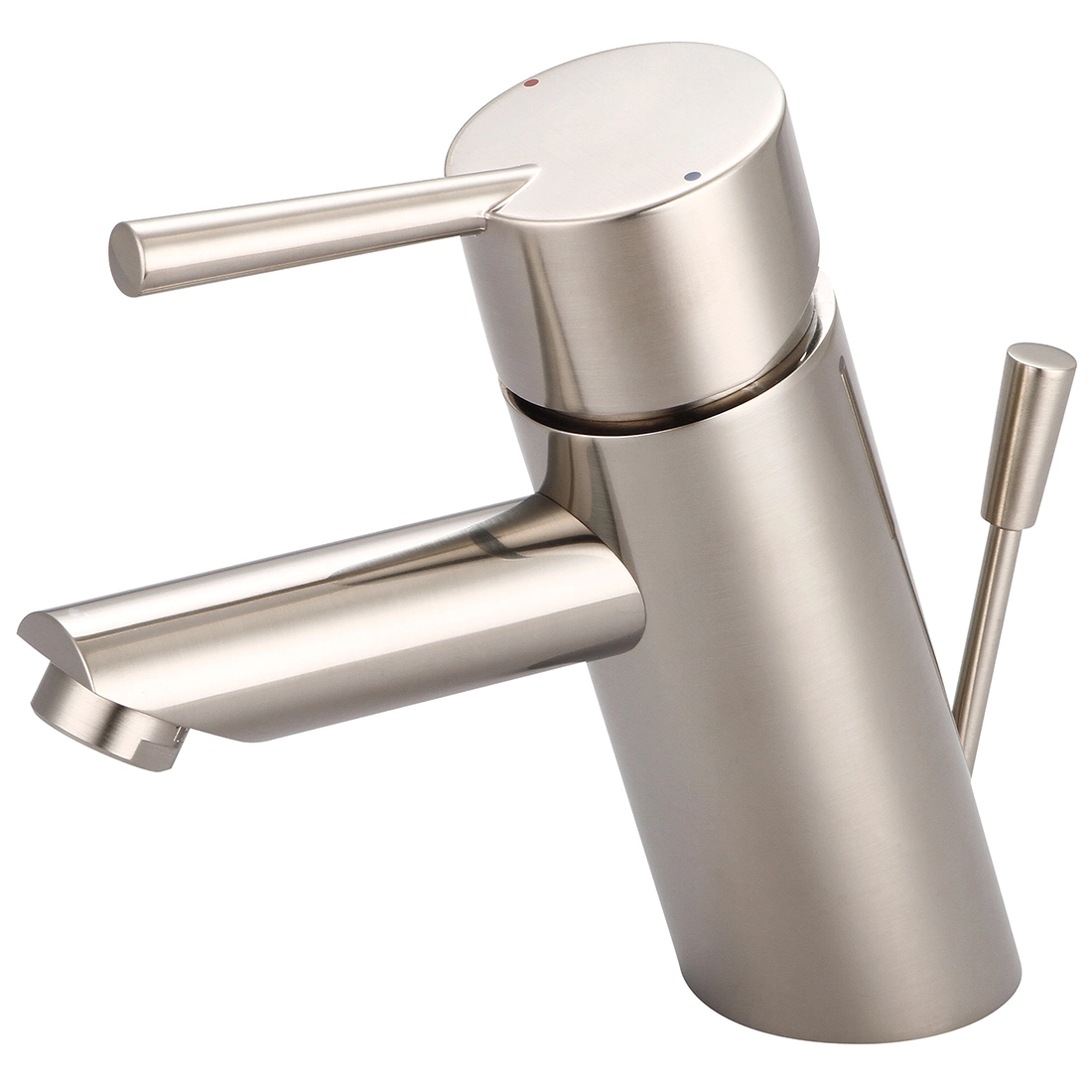
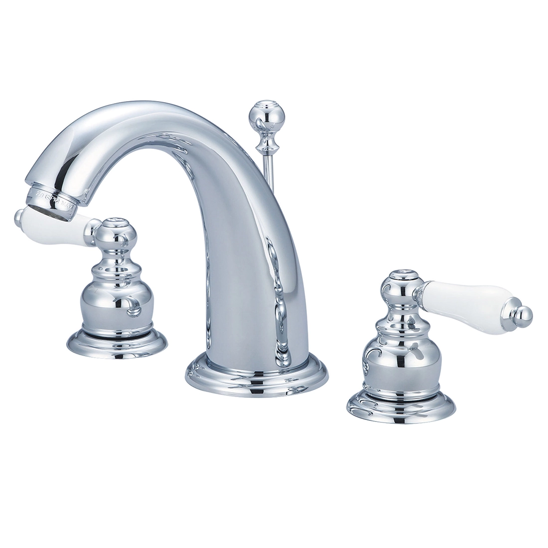
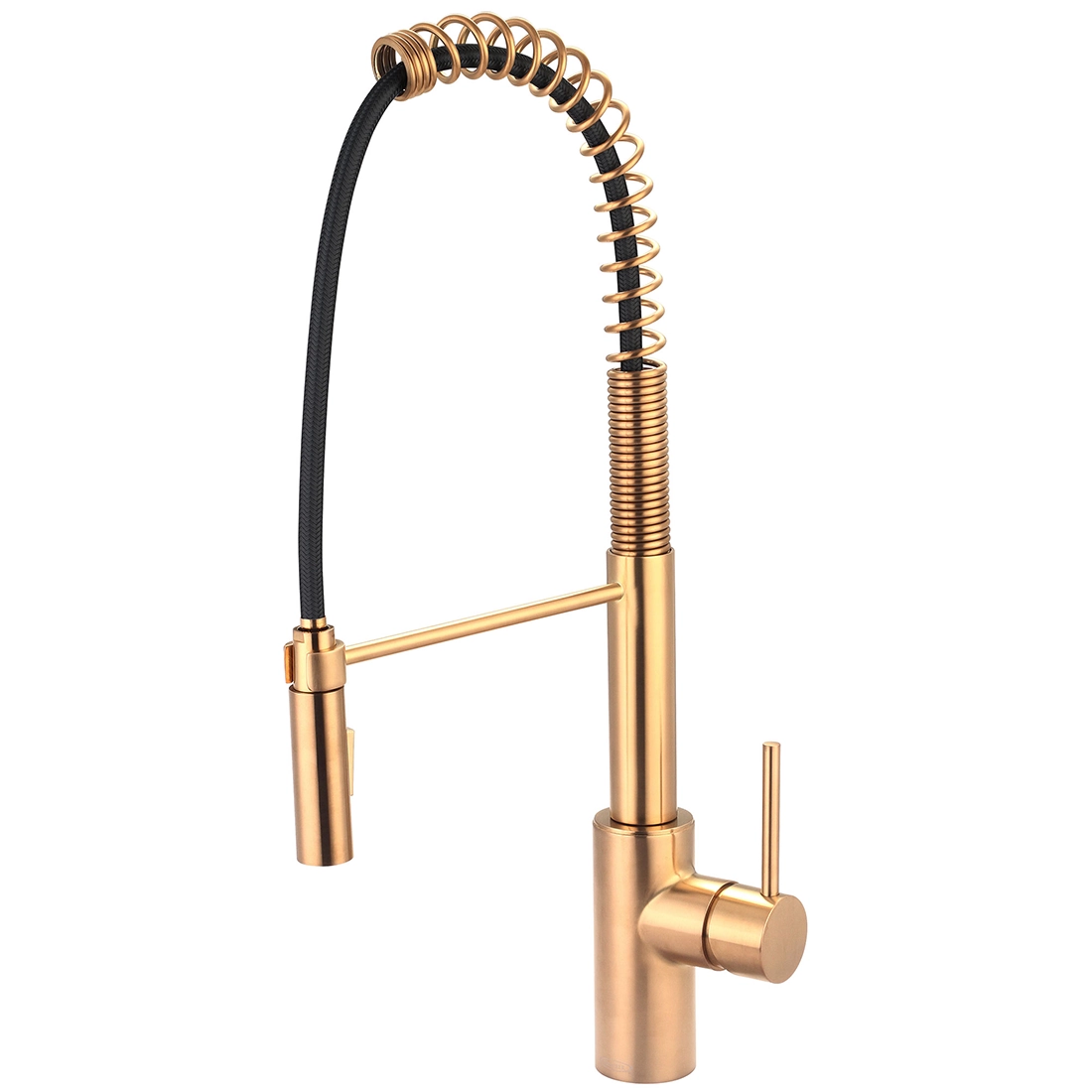
Here are our top picks and customer favorites in each metallic texture genre. Which will finish the look you’re creating in your bathroom or kitchen?